How I Built This Site with Claude Code
A build log of charlesmcquain.dev — why I chose Astro and Tailwind, how I drove the whole thing with Claude Code, and the architecture decisions (and one nasty CSS bug) along the way.
This site is the first thing I shipped in my build-in-public run, so it only felt right to make it the first thing I write about. Here’s the honest build log: the stack, the decisions, the workflow with Claude Code, and the one bug that ate an hour.
The constraints came first
Before any code, I wrote down what I actually wanted:
- Fast. A personal site has no excuse for shipping a megabyte of JavaScript. Target: 95+ Lighthouse across the board.
- Distinctive, not templated. No gradient-on-gradient hero, no glassmorphism cards stacked five deep. Typography should carry the weight.
- Low maintenance. I have a day job and a portfolio of other projects. This needs to be static and boring to operate.
Those three constraints made most of the stack decisions for me.
The stack
Astro, static output. Astro ships zero JavaScript by default and only hydrates the interactive bits you explicitly opt into (“islands”). For a content-and-portfolio site that’s exactly right — the homepage is pure HTML and CSS, and the only JS on the page is a tiny scroll-spy and the mobile menu toggle.
Tailwind v4. All styling is utility classes against a small set of design tokens — a warm near-black background, an off-white text color, and a single terracotta accent. Defining those as theme tokens once means every section stays visually consistent without a sprawling CSS file.
Cloudflare Pages. Static hosting, global CDN, free. There’s no server to babysit.
Content Collections + MDX for the blog. Posts are MDX files with a typed, Zod-validated frontmatter schema, so a typo in a category or a missing date fails the build instead of shipping broken.
The Claude Code workflow
The interesting part isn’t the stack — it’s how fast you can move when you treat an AI agent as a real collaborator instead of an autocomplete.
My loop looked like this:
- Describe the intent, not the implementation. “Redesign the skills section into a blueprint-style grid that stays on-brand” gets better results than dictating class names.
- Let it explore first. Before changing anything, Claude Code reads the existing components and matches the conventions already in the codebase — the rotated section labels, the accent-period headings, the spacing rhythm. New code that looks like the old code.
- Verify in a real browser, not in my head. Every visual change got checked across breakpoints — mobile, tablet, desktop — and I had it screenshot the result rather than assume it worked.
- Keep the guardrails in writing. A project instructions file encodes the non-negotiables (no company names, utility classes only, accessibility required) so they’re enforced on every change instead of re-explained every time.
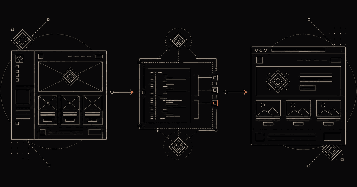
From Stitch design to Astro components
Not every part of this site started as code. When I wanted to redesign the skills and work sections, I explored visual directions in Stitch, Google’s AI design tool, before writing a line of markup.
The honest version of that workflow: Stitch is genuinely good at generating layout ideas fast — but its output isn’t something you ship. It invented placeholder content that wasn’t mine, drifted from my color tokens, and leaned into a generic, Google-flavored aesthetic. So I treated it as a wireframe, not a source of truth.
What actually worked was the handoff. I exported Stitch’s design and handed it to Claude Code, which translated the structure — a blueprint-style grid, big-metric impact cards — into my existing Astro components, using my real content, my design tokens, and the conventions already in the codebase. Keep the good bones, throw out the rest, rebuild it native.
That’s the pattern I’d recommend for AI design tools in general: let them widen the space of layouts you’d consider, then rebuild the winner properly in your own stack. The design tool gets you to a direction; the coding agent gets you to something you’d actually ship.
The bug that ate an hour
The mobile menu opened, but the hamburger never animated into an X, and content bled through behind the menu panel.
Two separate problems hiding behind one symptom:
- The hamburger animation relied on utility classes that were only ever added by JavaScript — they never appeared in the static markup, so Tailwind’s scanner never generated the CSS for them. The fix was to stop animating classes and instead swap two inline SVG icons via a class that does exist statically.
- The menu panel was collapsing to one pixel tall. The culprit: the nav bar uses a
backdrop-blur, andbackdrop-filterturns an element into the containing block for itsfixed-positioned children. So the full-screen menu was sizing itself against the 56px-tall nav bar instead of the viewport. Moving the menu out of the nav fixed it instantly.
Both are the kind of bug that looks like magic until you know the one CSS rule that explains it — and a good reminder that “verify in a real browser” earns its keep.
What’s next
The blog you’re reading is the real reason this site exists. From here it becomes the build log for everything else I’m shipping — the honest numbers, the AI workflows, and the lessons that don’t make it into the hype.
If that’s your thing, the newsletter’s right below.
Build-in-public, honestly.
Real AI-side-income numbers, the systems behind a solo content portfolio, and the engineering decisions along the way. No hype, no spam.